HOW TO DETERMINE IF YOUR IMAGE IS HIGH-QUALITY OR NOT
3 min read
UNDERSTANDING IMAGE QUALITY: IT’S NOT ONE SIZE FITS ALL
The idea of “best quality” for images can be different depending on who you ask. It depends on things like their knowledge, the platform they use, and what they expect. So, there isn’t a single “best quality” that applies to everyone.
Instead of looking for the absolute best, we should consider what works best for a particular platform or client. Trying to achieve a small increase in quality can be expensive and time-consuming. Sometimes, that extra bit of quality won’t even be noticed, especially if people view images on their phones.
RESOLUTION: GETTING THE BASICS RIGHT
Resolution is often associated with image quality, especially in product photography. It’s important to ensure that your photos meet the requirements of the platform where they’ll be displayed.
High-quality images are usually shot at 300 dots per inch (dpi) for printing and then scaled down to 96 dpi or 72 dpi for digital use. Getting even higher print quality, like 2400 dpi, requires expensive equipment.
Different platforms have specific size requirements for images. For example, Takalot asks for a maximum of 2048 px by 2048 px on ANY side, while WooCommerce prefers the maximum should be no higher than 1000px x 1000px.
Customers can zoom in on product images, but that can reduce the quality. To have more control over what buyers see, it’s a good idea to take close-up shots that highlight the product’s details instead of relying only on the platform’s zoom feature.

MORE THAN JUST RESOLUTION
At Prophoto, we believe image quality goes beyond resolution. We also consider how the image looks and how well it showcases the product’s features. A beautifully captured image is a waste if it doesn’t highlight what makes the product special. That’s why we pay attention to angles and how well the photo represents the product.

WHAT MAKES A GOOD PHOTO?
To evaluate product photos, we have some criteria:
- Color Accuracy: Does the image show the product’s true color? Lighting can change how colors look, so we use tools to make sure the colors are accurate.
- Visual Consistency: Do the photos from the same shoot look similar? It’s important to keep a consistent look throughout the images, even if they were taken at different times.
- Horizon Alignment: Is the product level in the photo? A crooked product suggests a poorly taken or edited image.
- Symmetry: Is the product balanced and even? Sometimes products aren’t perfectly symmetrical, but we try to make them look balanced in the photos.
.

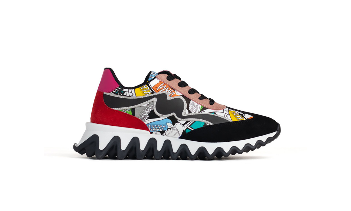
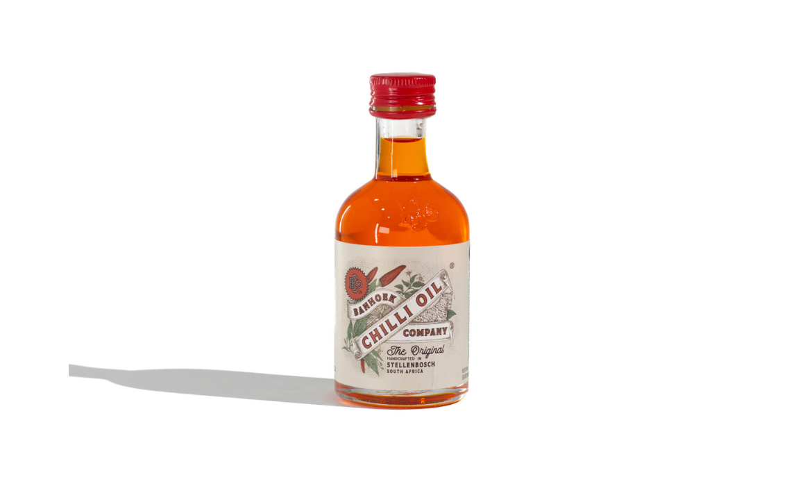
Example: Visual Consistency
.
CONSIDER COLOUR & LIGHTING
Getting colors right in product photos is challenging. Different lighting conditions can make colors look different. It’s important to meet customers’ expectations when it comes to color accuracy.
By paying attention to these factors, we can create better quality images that effectively showcase products without misleading customers.
If you would like to know more about product photo’s, we suggest checking out this article on “What You Need To Know Before Your Next Shoot“
New Products Arriving Soon?
Book A SHOOT